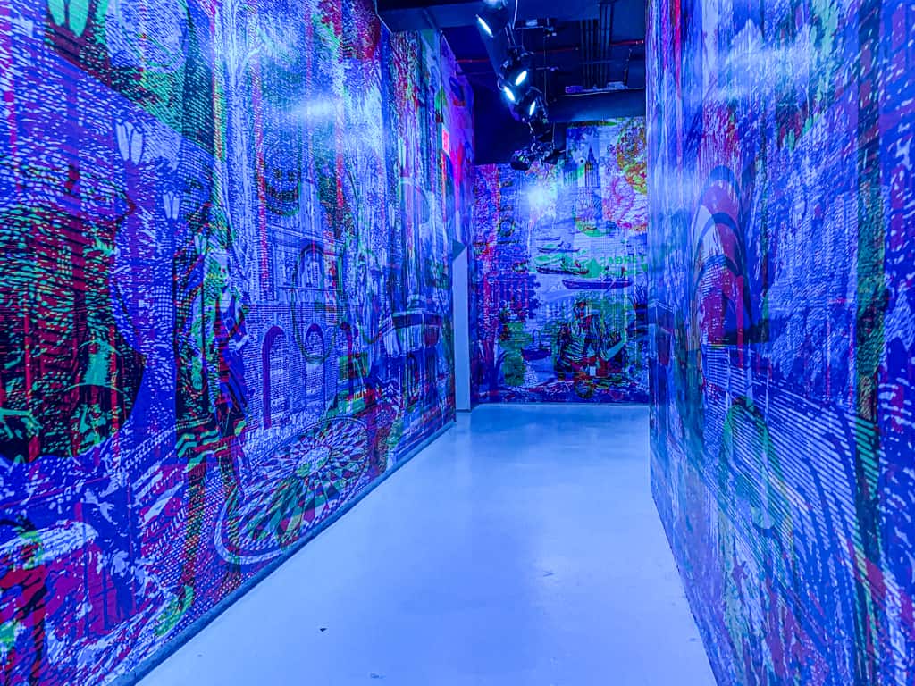
Colors are more than just a palette of shades and hues; they’re a language that speaks directly to our emotions. I often find myself drawn to colors that evoke a particular mood or atmosphere, be it the warmth of a golden sunset or the coolness of a misty morning. When creating a new piece, I’ll often start by selecting a color palette that resonates with the emotions I want to convey. For example, a piece about hope might begin with a palette of soft blues and whites, while a piece about anger might burst forth with fiery reds and oranges.
The Power of Complementary Colors
Beyond individual colors, I’m also intrigued by the way complementary colors can come together to create a sense of harmony and tension. The contrast between warm and cool colors, light and dark, can be used to create dynamic visual interest and draw the viewer’s eye to specific areas of the composition. I’ve found that when I balance these opposing forces, the result is a piece that’s both visually striking and emotionally resonant.
Shapes: The Building Blocks of Meaning
Shapes, too, hold a special significance for me as an artist. Whether geometric, organic, or abstract, shapes have the power to convey meaning and guide the viewer’s gaze. I often use shapes to create a sense of depth and dimensionality, for example, by layering overlapping forms or using negative space to create a sense of breathlessness. When working with shapes, I find myself exploring the rich symbolism and associations that each one carries – the circle representing wholeness, the triangle embodying balance, and so on.
The Interplay Between Color and Shape
As I work with colors and shapes, I’m constantly seeking the sweet spot where they intersect and become something greater than the sum of their parts. When a shape is infused with a particular color, it can take on new meanings and connotations, creating a visual tension that pulls the viewer in. I’ve experienced this magic firsthand, when a yellow square morphs into a sun, or a blue circle becomes a wave.
Nature’s Colorful Canvas
Speaking of the natural world, I’m often inspired by the kaleidoscope of colors found in nature – the vibrant hues of sunsets, the soft pastels of misty mountains, the bold contrasts of urban architecture. I might translate these colors into bold brushstrokes, soft watercolors, or even mixed media textures, depending on the mood and message I want to convey.
The Never-Ending Quest for Inspiration
As an artist, I know that inspiration can strike at any moment, sometimes when I least expect it. For me, that might be in the colors of a sunset, the shapes of a cityscape, or even the patterns found in the natural world. When I’m feeling stuck, I’ll often take a walk, collect leaves or stones, or simply gaze out the window, allowing the world to seep into my subconscious and feed my creative soul.
Conclusion: The Endless Possibilities
Colors and shapes are the foundation upon which my artistic world is built. Through my work, I hope to share the beauty, emotion, and meaning that these elementary building blocks bring to my own creative journey. Whether on canvas, paper, or even the digital realm, I’m constantly seeking new ways to weave colors and shapes into a tapestry of meaning and beauty.

